Monday is a big day for our team here at Critical Mention, and for anyone who knows the value of merchandising their PR and communications successes.
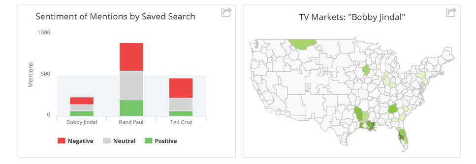
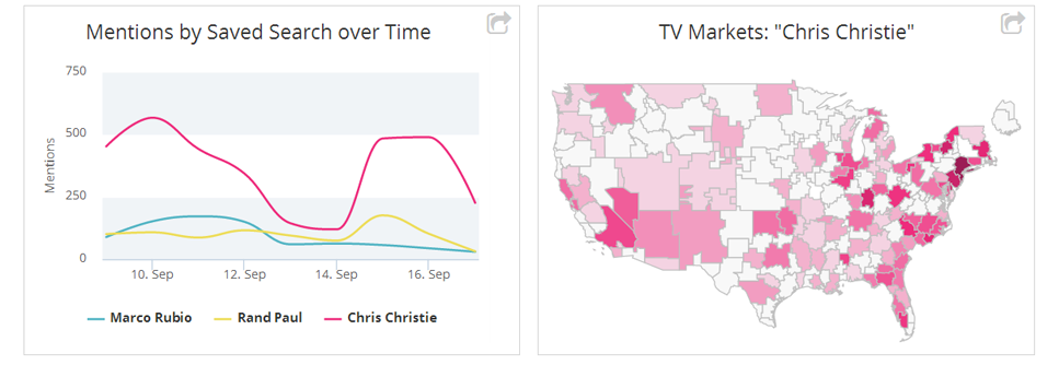
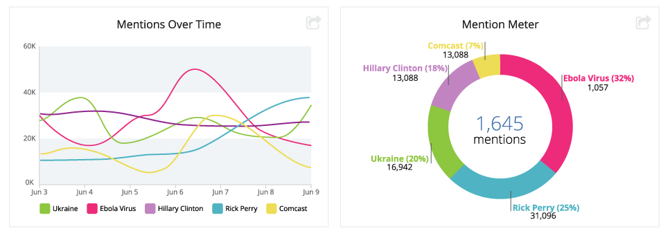
When logging into the platform Monday morning, a select group of subscribers will notice a new Critical Mention Analytics page containing bar and pie charts, line graphs, word clouds and a colorful mention meter.
Critical Mention Analytics, which will be rolled out to all of our users over the next several weeks, are designed to help you showcase your media coverage to internal audiences, and to give you a clear understanding of your competitors’ earned media coverage.
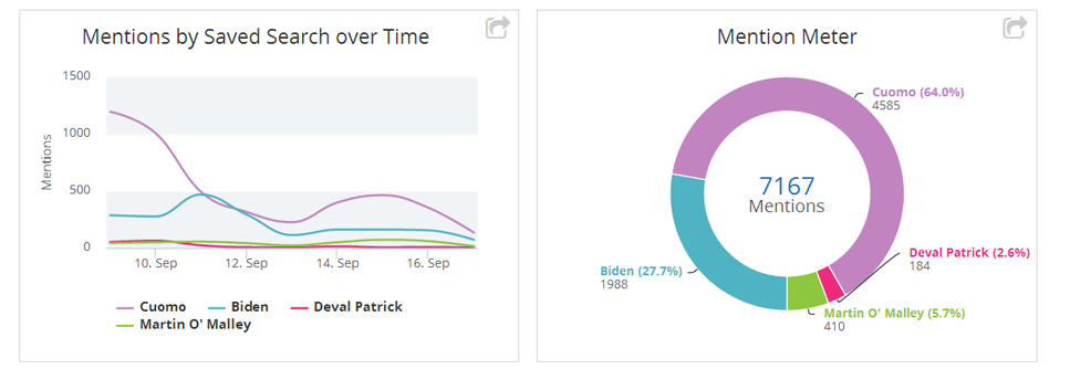 There’s no extra charge for this new set of features, which are driven by a powerful natural language processing engine and based on your saved searches. We’re expecting Critical Mention Analytics to get wide adoption.
Among the benefits:
• Make internal coverage reports more impactful with the inclusion of charts and graphs through our export feature
• Use word clouds to determine which topics and experts are included in your coverage
• Visually map the density of coverage by media market to spot your strengths and those of competitors
• Present bar charts and line graphs showing both volume and positive/negative sentiment of coverage
We’ve scheduled a free webinar for Monday at 2 p.m. ET to walk through the new features and answer questions about Critical Analytics. Register here.

