
If you’re selling a product or service, you need a Call to Action (CTA). CTAs are an element on your page that encourage your audience to learn more. They come in many different forms, but the one element that remains consistent is how you design your CTA. We’ve listed five highly effective CTA examples that will inspire your own!
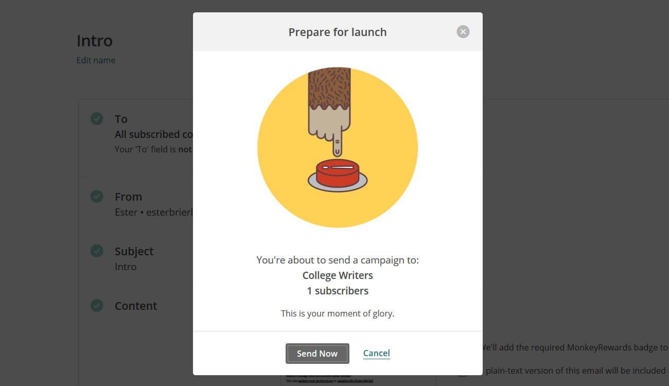
1. MailChimp is great at creating effective CTAs. One of its best examples is their “Prepare for Launch” pop-up which encourages visitors to subscribe for an email campaign. There’s no unnecessary text, the picture has a lighthearted feel which entices visitors to click the “Send Now” button.
2. Mercy Corp’s CTA creates a sense of urgency, which is the best choice for such critical and challenging issues worldwide. It uses a photo that shows the real people that are suffering. This humanizes the ad and has a strategically placed “Donate Now” button front and center.

3. Another excellent example of a CTA is Spotify’s website. A simple slider gives you a basic understanding of the service and its advantages. This CTA isn’t aimed to create the “wow” factor. It cuts through the clutter and gives you two options.

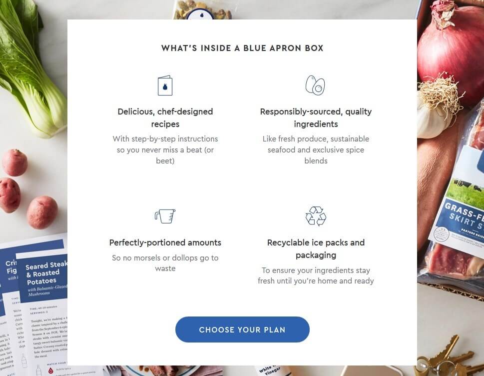
4. Blue Apron’s website is full of all kinds of CTAs. This section explains what you can get and how much you have to pay for it. It’s an easy way to inform your readers and an effective way to help them order your products.
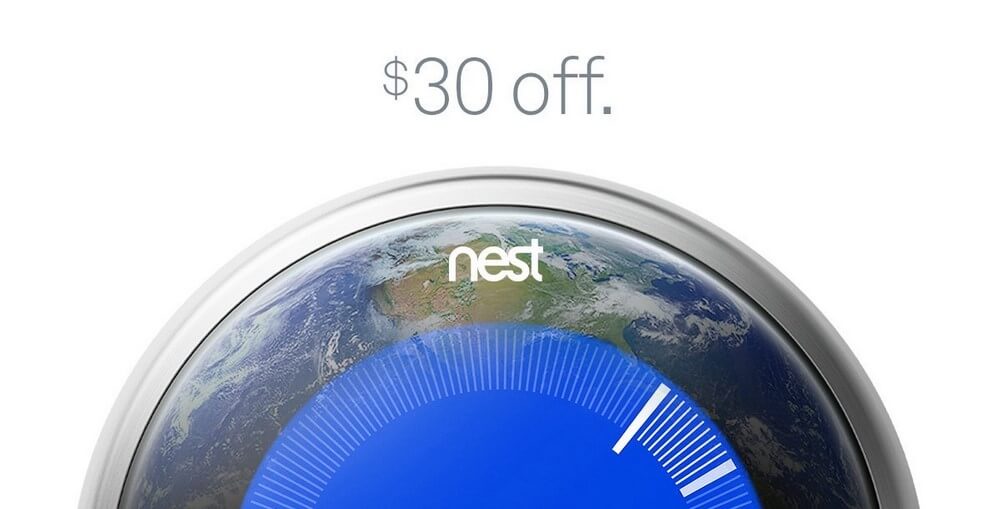
5. Nest’s CTA combines a message about Earth Day and the actual product which can help you save energy. It makes its product look like a planet, informing visitors how much money they can save if they click its button.
Until next time!
Critical Mention

Ester Brierley is a QA Engineer in a software outsourcing company but considering a career change. Now she is a competent virtual assistant and seasoned content creator for College Writer. And in her spare time, Ester takes online courses to improve her marketing skills. Follow her on Twitter.


